The Comment Project — WIP
Last quarter (Fall 2021) I proposed several design interventions that might contribute to a more meaningful online ecosystem of conversation. I began this quarter (Winter 2022) focusing in on three directions: “Convo”, “Foreground”, and a rethink of the way we use emojis to communicate in comment threads (which has yet to be named).

Convo cleans up comment threads.
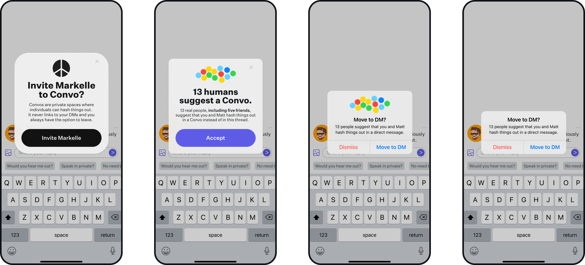
Convo situationally centers on two or more individuals “clogging up” a comment thread. This could be through a hostile back and forth, or simply a meaningless, boring, and unproductive dialogue. The heart of this feature lies in the novel ability of other users (peers) to recommend that the interlocuters move their conversation away from the thread to a direct message. Once recommendations pile up to a certain level, the interlocuters are alerted that their conversational peers want them to “get a room”. If accepted, the dialogue in questions will be moved from the thread and into a direct message, the chrome of which is populated with helpful conversational and confrontational tips and prompts.

Foreground finds meaning.
Foreground allows users to respond to the minutia of posts online. The core of the idea is to combat a wholesale reaction to a longer poster. What if someone says something I simultaneously agree and disagree with? Responding with a “Like”, doesn’t necessarily do justice to my visceral and complex reaction. Foreground gives the user not only the ability to Like certain aspects of posts, but they can also respond with the emoji of their choosing, adding a level of richness that simply is not there otherwise.
After a certain threshold of responses has been crossed, the data collected will start to bubble up to the surface of the interface. Highly responded sections will begin to evidence themselves, allowing individuals to find and interact with the most valuable parts of the post.
Emojis need some extra love.
My emoji intervention is the fledgling of the three. The motivating idea behind it is that way way we currently use emojis often lacks meaning and nuance. Now, I’m interviewing individuals to understand how they use these kinds of symbols. My goal is to create a set of emojis that allows users to show contradictory emotions and thoughts in a single symbol. I’m working with my chair — Karen Cheng, an expert in the field — to meticulously design and test these emojis.
Making Phase
This quarter was focused on building a base UI on which my interventions will be placed. I advanced a few of my interventions into a prototype phase, ready to be tested, but still have some work to do when it comes to poshing the individual pieces.
How can an interface be both everything and nothing?
As I stated last quarter, whatever I’m building will have to be platform agnostic. This leads to an interesting design challenge: how might one design interventions that would work for any and all platforms, but not feel too much like one or the other? Such a challenge means designing an UI that is both everything and nothing at the same time. Designing for everything entails designing interventions that feel as though they could seamlessly transition into (largely) any major social platform. On the other hand, designing for nothing means creating something that feels familiar, but not wholly recognizable. Ideally, the base UI would recede to the background of the experience — if a user gets tied up in interesting icons or cool display typefaces, I have either under or over designed as aspect of the interface.
How to steal from existing UI patterns?
At the beginning of the quarter, I was set on designing the perfect comment thread. Rather than learn from what exists in the world today, I would design the UI from the ground up. Below, you can see my first pass at this (). It’s clear I wasn’t doing anything new quite yet — consciously or not, it looks like I just redesigned Reddit’s UI.

I presented the pictured iteration to an outside professional, a master when it comes to interface design. This person gave me sage (and common sensical) advice: copy what’s been done before and improve it from there. His elaborated on this directive: “create a pixel–for–pixel redesign of TikTok’s home screen, Twitter or Reddit’s threading, etc.”
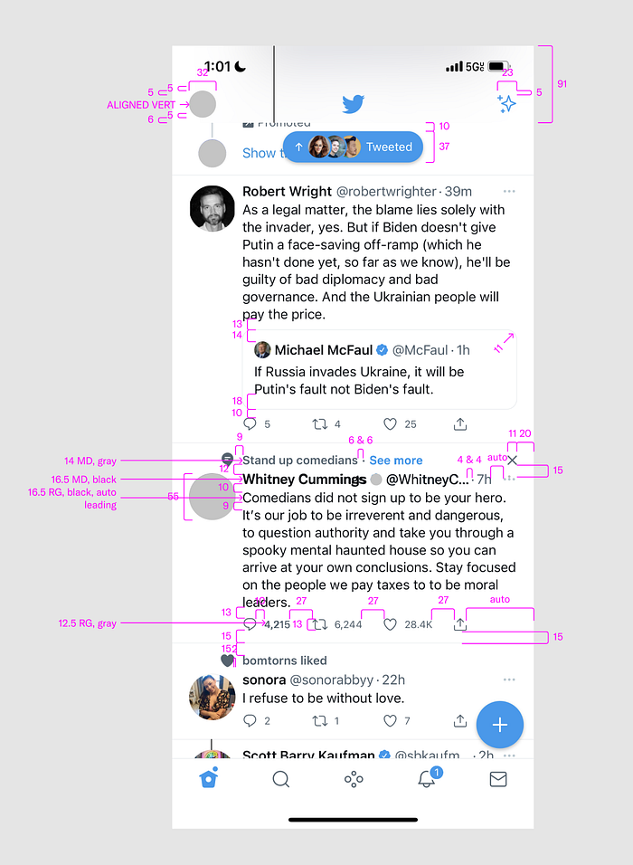
This advice set me, visually, on a new course entirely. Rather than toil away homing in on four- or eight-pixel corner radii, for example, I could enter a cheat code (paste a screenshot into Figma) and have the answer in a matter of seconds.

What I found during this process is that interfaces are beautiful objects in and of themselves. In a word, they are more designed than I could have imagined. I found Twitter’s visual design, for example, to be a demonstration of a mastery over color, composition, and typography (shout–out Grilli Type). Further, the macro and micro interaction patterns are beautiful, intuitive, and fun. Taking infinite screen shots and recreating them was a challenge, but one of the best lessons in product design to date.
Black & White to Color
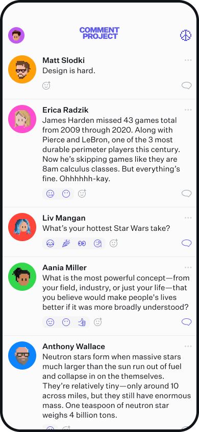
Going back to the beginning of the quarter — one design parameter I set for myself was to make my interface rely on typography for hierarchical delineations. I simply refused to use color. This was a noble challenge, but one that ultimately fell flat (pun intended). The interface mockups that resulted from this exercise were a bland jumble of black, white, and gray. It was harder than necessary to follow and left something to be desired.

To delineate quickly and easily who was saying what within the interface, I added color to the profile picture backgrounds. Rather than rely on names or icons to understand who was saying what, the instantaneous nature of color allowed for an immediate understanding of what was happening in the thread.
This splash of color started seeping into the overall branding of my project. I introduced a deep blue color for primary logos, labels, buttons and emojis. This added the kind of richness while aligning the visual tone of the project to the motivating ethos of the project.
How to show emojis?
When it came to representing emojis, I’m admittedly unsatisfied with where I’m currently at. Initially, I wanted to organize emoji responses in word clouds (see below) — doing so would allow for a visual striking and novel way of doing something that’s been done a million times before.

This proved to be interesting, but untenable. How would users interact with the cloud? The smallest emojis would be far too small to tap. Not to mention the kind of real estate these things would take up. For the moment, I’ve been working with a Discord inspired kind of “bucket” in which the emojis can hang out. Does this need to be revised? Yes — but that will be sorted later.
Typography
From the onset of this project, I knew whatever I was going to make would be set entirely in Untitled Sans. However, I knew I would need to do my due diligence, and at least look at a few other sans–serif fonts. My criteria were short but specific. Whatever typeface I chose must come from an independent foundry, must have a high x–hight (duh) and it must be super dope. I perused some of my favorites: ABC Diatype (ABC Dinamo), Founders Grotesk (Klim) Area (Blazetype), and Lars (Bold Decisions). I love these typefaces, but nothing spoke to me the way Kris Sowersby’s reluctant masterpiece does. Untitled is the only typeface featured in my project.

Practitioner Input
Over the course of the quarter, I’ve met with a handful of highly skilled interface and app designers. These meetings were off the record, so I will refrain from mentioning them by name.
One advisor gave me some simple but revelatory advice: “whatever you make, don’t brand the thing.” Up to that point, I had been positioning my interventions as standalone features, things to be added to an existing platform (see below for how things started to shift). The genius in not branding these interventions is the fact that by leaning on exiting patterns and features, whatever I make can slide effortlessly into existing platforms. I won’t have to argue that Twitter, for example, should adopt the Convo intervention and everything that comes with it. Rather, by using Twitter’s existing Direct Messaging system, they can get all the added value of Convo without the extra calories.

I was also instructed to think about when to deploy the Convo notifications. Rather than alert the individual the exact moment Convo recommendations are made by peers, think about when the ideal moment of intervention might be. After some discussion, we reasoned that alerting might be best deployed right after someone “smashes” the send button (see below).

This advisor went on, encouraging me to lean into the research I’ve conducted on nudging and social pressure when it comes to behavior modification. When alerting the subjects of a Convo request, perhaps they should see how many people want them to “get a room”. What if their credentials were shared with the subject themselves? This is a thread I have begun to pick up, but one that needs further exploration.
Another outside advisor additionally pressed me to lean into the craft of my project. No matter how strong the concept might be, if this thing isn’t made with an obsession over detail, it will fall flat. He went on to press the idea that when this is being tested, if the feel or look of the prototype are distracting, the user will be focused on that. Users need cognitive clarity to give insight into the conceptual underpinnings of the project.
With that, he instructed me to recreate the UI of existing platforms. As I mentioned above, this exercise was particularly helpful for my development as a digital designer. Platforms like Twitter (whose UI I’m particularly fond of) have already nailed the execution of visual organization and design. By recreating various UI’s, I was reminded that as designers, we stand on the shoulders of giants. Reinventing the wheel just isn’t always necessary.
Final Thoughts
As I approach the end of my making phase, I’m looking forward to seeing how all three interventions will play on one another. My base UI and visual system is nearly complete. Tightening up the intervention flows themselves is where the remainder of my time and energy will be placed. Testing and interviewing with participants will give me clarity as to if I’m on the right track or not. Overall, I’m excited about this project and the good it might do for our online ecosystem of conversation.
